


Top 7 Mistakes That Cost Teams Points in Airport Concession RFPs
Where Good Concepts Fall Short: Even Great Concepts Can Lose Points
Airport concession RFPs represent some of the most competitive procurement opportunities in the travel, hospitality, food & beverage, and retail industries. Months are spent developing concepts, negotiating partnerships, building financial models, and preparing hundreds of pages of documentation.
Yet despite all of that effort, many proposals lose valuable evaluation points – not because the concept isn’t strong, but because avoidable mistakes distract from the overall presentation.
From compliance oversights to inconsistent formatting and weak visual communication, seemingly minor issues can influence how evaluators experience your proposal.
Fortunately, most of these mistakes are entirely preventable. After more than 15 years supporting airport food & beverage and retail concession RFPs, we’ve seen firsthand where proposals lose momentum – and how thoughtful planning can prevent many of these issues before they happen.
It’s not because the concept isn’t good enough. It’s because the proposal doesn’t clearly, consistently, or confidently communicate that concept.
Great proposals don’t lose because of one major mistake – they lose because of dozens of small ones.
Before You Begin…
No two RFPs are exactly alike. Every airport RFP solicitation is different – each with its own requirements, evaluation criteria, page limitations, submission instructions, forms, and technical specifications. Each RFP ask is different and should be treated as such. Do not get complacent and assume one RFP submission is good for all… that’s the wrong mindset.
Before writing a single page, make sure your team fully understands:
- Submission requirements
- Page limitations
- Mandatory forms
- Evaluation criteria
- Technical specifications
- Deadlines
Starting with a clear roadmap reduces mistakes later in the process.
1. Forms, Certifications, and Compliance Requirements
One of the most critical — and often overlooked — areas of an airport RFP is compliance. These submissions come with strict requirements, including:
- Required forms
- Certifications
- Signatures / notarized documents
- Financial disclosures
- Legal acknowledgments
Missing just one signature or required form can result in the entire submission being labeled non-compliant — and immediately disqualified.
It doesn’t matter how strong the concept is or how well-designed the proposal looks. If it’s not compliant, it won’t be evaluated.
How to avoid it:
Build a compliance checklist early and review it multiple times before submission. Assign ownership to ensure every form, signature, and requirement is completed accurately. In airport RFPs, compliance is not optional — it’s the baseline requirement.
2. Lack of Clear Structure and Organization
One of the fastest ways to lose an evaluator’s attention is through a disorganized proposal. Think of the airport’s outline as a roadmap. Evaluation committees often review proposals in the same order as the scoring criteria. Following that structure allows evaluators to locate information quickly while ensuring every question is addressed completely.
Airport RFPs are long, complex, and multi-layered. Without a clear structure, even strong content becomes difficult to navigate. Common issues include:
- Inconsistent section breaks
- Overloaded pages with dense text
- No clear hierarchy between headings and content
- Key information buried too deep or unclear
- Most RFPs will provide an outline of how they would like your submission put together. Follow that list to a “T.”
When a detailed submission outline is provided, use it!
Evaluators don’t have time to search for what matters. Less is more — be concise!
Another common mistake is not directly answering the question(s). Some RFPs request “Questions to be restated” and Answers to follow – not restating the exact RFP question can cause point deductions.
Airport RFPs are structured intentionally — each question is there for a reason. When responses become too broad or overly narrative, evaluators are forced to search for the information they need. This can lead to point deductions. Be clear and answer the question directly as early as possible.
How to avoid it:
Be clear and direct — build an intuitive structure from the start. Answer the question exactly as it’s asked, then support it with visuals or additional context. Make it easy for evaluators to find what they’re looking for — clarity and conciseness always win.
-
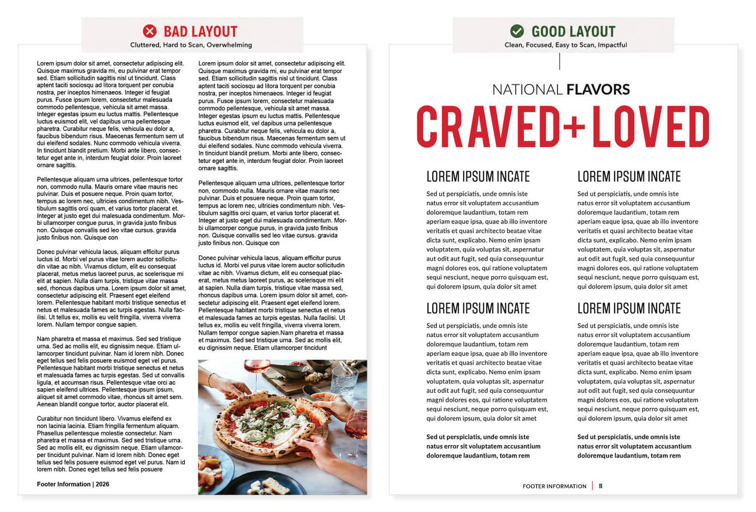
- Immediately communicates visual hierarchy – instant focal point.
-
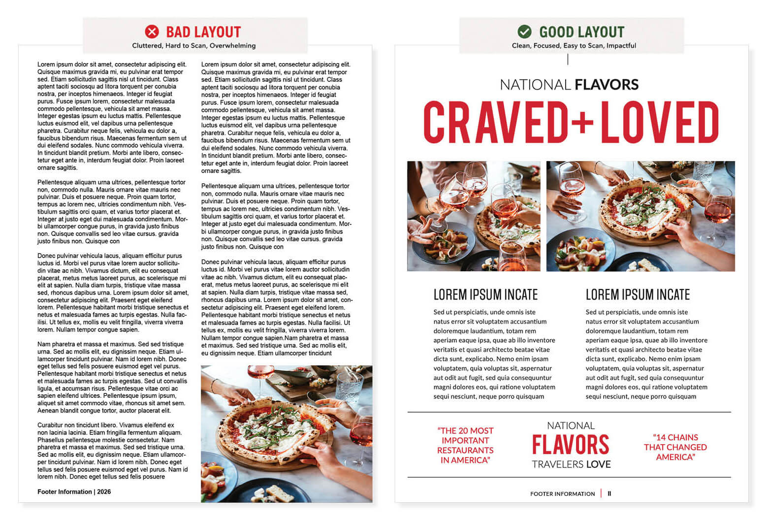
- Easier to consume, uses negative space – editorial feel.
3. Trying to Say Too Much (Instead of Saying It Well)
Many teams fall into the trap of over-explaining. They include everything — every idea, every detail, every data point — thinking that more information will strengthen their proposal. In reality, it often does the opposite. When content is too dense:
- Key messages get lost
- Evaluators become fatigued
- Important differentiators are harder to spot
Don’t make the airport search for your answers — make them obvious!
The whole point of an RFP submission is to be “short-listed” to the next round. Once the airport short-lists your submission, you are then asked specific questions to present additional information — this is where you close the deal through direct conversation with the evaluation panel.
How to avoid it:
Focus on clarity over quantity. Prioritize your strongest points and support them with clean visuals, concise language, and well-structured content. The goal is not to say more — it’s to say it better.
4. Inconsistent Branding Across the Proposal
Airport RFPs often involve multiple contributors, which can lead to inconsistencies across sections. We see this all the time:
- Different fonts, styles, and formatting
- Misaligned layouts and structural disconnects between write-ups
- Varying tone and messaging — maintain one consistent voice throughout the proposal
- Disconnected visuals between volumes and sections
These inconsistencies may seem minor, but they create friction for evaluators and weaken the overall presentation.
How to avoid it:
Develop a cohesive design system early. Ensure all contributors are working within the same visual and structural framework. Consistency across every page signals professionalism, organization, and attention to detail.
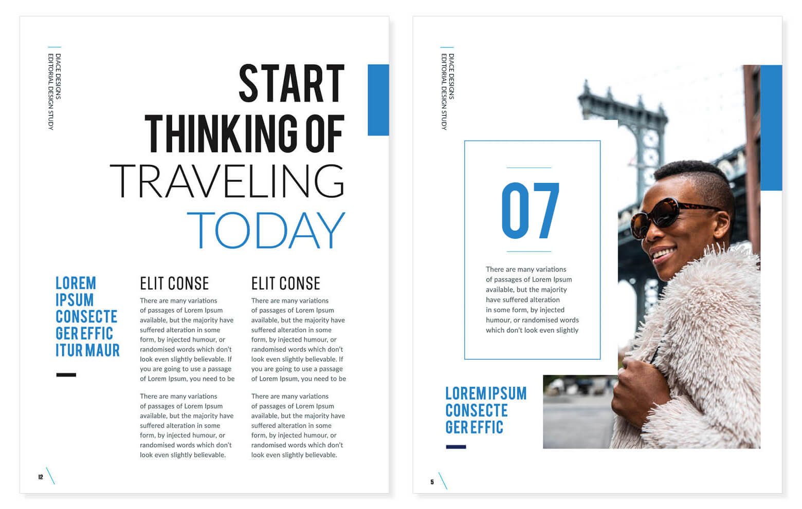
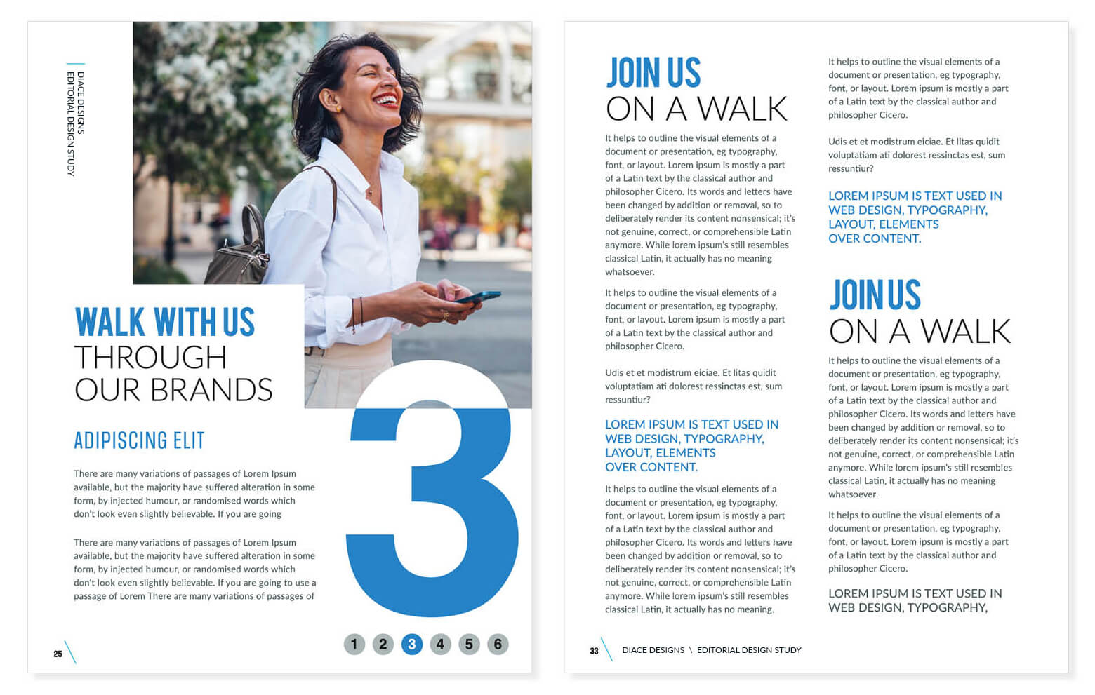
5. Weak Visual Communication of the Concept
A strong concept is only as effective as how well it’s communicated. Too often, proposals rely heavily on text and fail to bring the idea to life visually. Visual storytelling helps evaluators picture the passenger experience, the customer journey; you want them to envision your brand’s experience – that’s powerful storytelling!
Visual storytelling helps evaluators imagine the passenger experience long before the concept is built. High-quality renderings, lifestyle imagery, and thoughtful brand storytelling create an emotional connection that extends beyond the written narrative, allowing evaluators to visualize how the concept will come to life.
Every successful concept begins with a clear visual direction. Mood boards align the brand, materials, colors, textures, and customer experience into one cohesive story before design development begins.
-

- Visual Storytelling Mood Board: Help evaluators see the experience – not just read about it.
Strong visual storytelling often includes:
- High-quality renderings – multi-angle renderings are key
- Less is more – don’t overuse text-heavy pages
- Quality visual storytelling and/or lifestyle imagery – images sell brands!
- Brand storytelling pages – describe your why directly and speak to a sense of place
- Infographics – strong data designs are more compelling than Excel spreadsheets
You want them to envision the brand, see/touch/smell/taste the experience – that’s powerful storytelling! Don’t skimp out of powerful visual aids…use your budgets wisely!
Evaluators need to see the concept — not just read about it. Less is more – we can’t stress this enough! Remember — these panels of evaluators are reviewing hundreds of pages, from multiple different companies.
How to avoid it:
Invest in visual storytelling. Use renderings, imagery, diagrams, and layout to show how the concept will live in the terminal. A strong visual narrative makes your proposal more memorable and easier to understand.
-
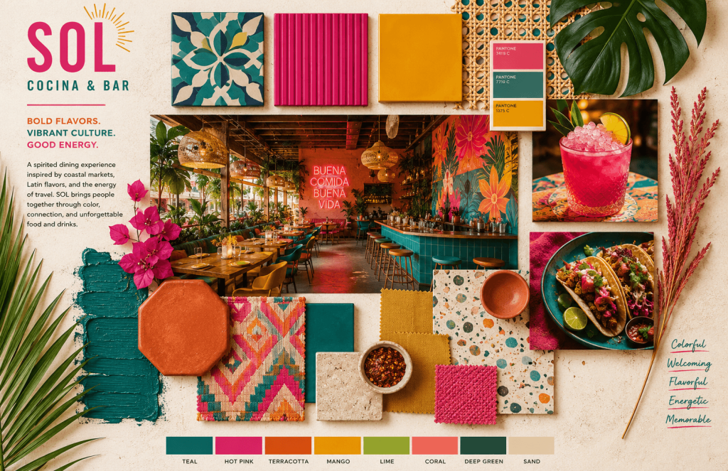
- Visual Storytelling Mood Board: Bring the brand to life through bold visuals that create an immediate emotional connection.
6. Underestimating the Importance of the Final Presentation
Even when the content is strong, the final presentation can make or break the submission. Common last-minute issues include:
- Formatting inconsistencies
- Mislabeling sections or file names requested in RFP
- Misaligned charts or tables, or replacing pre-filled formulas
- Low-resolution images or watermarked images
- Rushed layouts – sloppy design does not deliver high reward
- Lack of polish across volumes — consistency is key!
These may seem small, but first impressions and details matter — especially in a competitive environment where every submission is being compared side by side.
How to avoid it:
Give the final presentation the attention it deserves. Review every page, ensure consistency, and allow time for refinement. A polished submission reflects confidence, preparedness, and execution.
7. Waiting Until the Last Minute to Design the Proposal
One of the biggest misconceptions is that proposal design happens after the writing is complete. In reality, strong airport proposals are designed alongside or before content development. Waiting last minute to rush, design, write, and complete requirements with 1-2 weeks prior to an RFP submission deadline is asking for point deductions.
When rushed and frantically trying to meet a strict deadline because of a late go-no-go meeting, you’re risking more than just compliance in your RFP submission. Waiting until the final week often results in:
- Rushed layouts and storytelling…“just need words on a page”
- Inconsistent branding…“no one cares about pretty pictures”
- Weak visual storytelling… “they already know this brand, we don’t need to tell them”
- Form errors, missing notary signature, JV documents missing, partner certifications missing, etc. – which automatically defaults to a non-compliant RFP submission, disqualifies all your hard work, and 9/10 times your submission is tossed in the trash!
How to avoid it:
Bring your design team into the process early so the proposal evolves together instead of being assembled at the end.
Preparing for an RFP?
Small Mistakes, Big Impact… and Millions on the Line!
RFPs are high-stakes opportunities where small details can have a big impact. Avoiding common mistakes isn’t just about protecting your score—it’s about presenting your team with confidence.
For more than 15 years, Diace Designs has helped airport concessionaires, retailers, hospitality, restaurant operators, and development teams transform complex information into compelling proposal experiences. The teams that stand out are not always the ones with the most ideas — they’re the ones who communicate those ideas clearly, consistently, and strategically.
From proposal strategy and editorial design to renderings, visual storytelling, and production support, we help teams create submissions that are organized, memorable, compliant, and evaluator-friendly.
Avoiding these common mistakes can significantly improve how your proposal is received, understood, and remembered. Because the strongest proposals don’t just answer the RFP—they make it easier for evaluators to say “yes.”
At Diace Designs, we help teams navigate this process with clarity and confidence — creating proposals that are not only compliant, but compelling. Every airport RFP represents an opportunity to earn trust before the first interview ever takes place. Make sure your proposal reflects the quality of the team behind it!