USF Logo Debacle Takeaways
Branding Gone Wrong
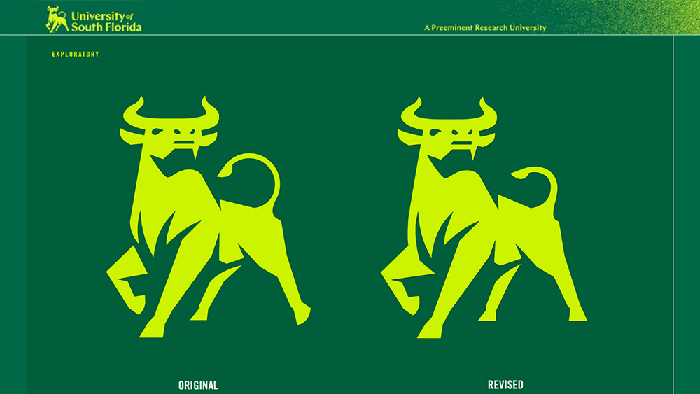
After spending nearly two years and $50,000 on a large scale rebranding campaign, the University of South Florida’s new logo is still a topic of contention among USF students, faculty, and alumni. When the University of South Florida ( USF ) decided it was time for a brand update, they were optimistic—bullish even. Perhaps a bit too bullish.
The unveiling of the new USF logo stirred up vitriolic attacks, comparisons to the Merrill Lynch logo, and a petition signed by more than 7,800 people who demanded the old logo be reinstated. Not exactly the reception USF’s marketing department was hoping for. What can we learn from this rebranding nightmare? Where did USF go wrong?
A “Unified” Brand
Established in 1956 and spread across three campuses, USF had accumulated a variety of logos representing various aspects of the institution (see Slide 3). The USF brand lacked cohesion and consistency, both critical elements of a high-quality brand. However, instead of creating a unified identity, the University Communications and Marketing department widened the divide when they opted to update the academic logo only and leave the traditional athletic logo untouched. The decision, meant to placate zealous USF sports fans and alumni, resulted in a brand that is now even less cohesive than before. This was the first misstep.
If It Ain’t Broke…
The second critical error in this rebranding campaign is something we’ve seen before: the disastrous effects of trying to fix something that wasn’t broken in the first place. In this case, it’s the traditional green and gold hues of the old USF brand. These colors were a common thread running through the myriad USF logos—evidence that they resonated strongly with university stakeholders. Changing the distinguished gold to an eye-popping chartreuse was unexpected and undesired, and it became a primary motivator behind the demand for a logo recall.
Leveraging Resources
In addition to the blunders mentioned above, USF also seems to have missed an opportunity to leverage the resources available to them. Forking over $50,000 to an agency may make sense for some rebrands, but when you have a pool of more than 40,000 students who all have a personal connection to, and an investment in, your organization, why not draw upon their skills and passion? Why not offer even a fraction of the $50,000 as a scholarship awarded to the student with the best new logo concept? The rebranding campaign could have been a shining PR moment for the university instead of the embarrassing gaff it is today.
There’s not just one “right” way to conduct a rebrand, but there are definitely pitfalls to avoid. If you plan to embark on your own rebranding campaign, Diace Designs can help you navigate through the challenges to produce a brand that’s extraordinary and newsworthy—for the right reasons. Contact us to learn more.

About Kara Franco
Kara writes copy that speaks. She has a knack for creating clear, compelling messages without wasting words. She is passionate about digital marketing and believes that copy is the cornerstone of user experience.
Copywriter + Content Strategist
Kara@diacedesigns.com


